I don’t remember much from my high school German class except maybe a few standard phrases. Thankfully a grasp of the language was not necessary when I got the call for this project on a Friday around 5pm, one week before the start of Oktoberfest.
First thing i needed was to research the subject, intensely. Belgian style beer you say? Brats and french fries? Please and thank you! Located on historic Mill Avenue in Tempe, Handlebar carries great international and local beers on tap.
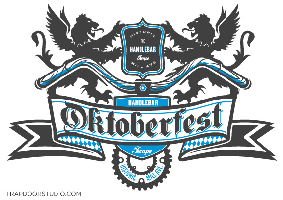
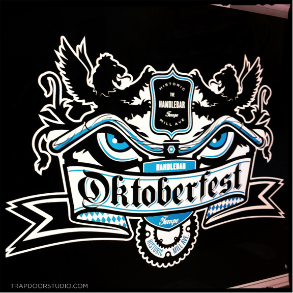
After I calmed down a bit we defined the goal of the project: Blend a proper German crest with a “bike-friendly”Tempe beer garden to create a unique Oktoberfest logo.
Sketches included Bears, German beer girls and a few other mythical creatures. Ultimately winged lions won and I set about combining elements of the traditional crest with a bicycle twist.
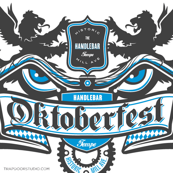
Gray blue and white colors drawn from logo & Bavarian flag. “Evil Eye” version
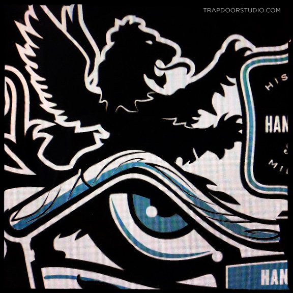
Detail of Lion. Client requested the Evil Eye treatment. So i delivered!
I’m partial to Hefeweizen (wheat beer), my favorite is a Brewery in Munich called “Franziskaner”. If you haven’t had this beer and enjoy a great Hefe, I would urge you to seek it out.
Alternate crest option (without eyes) for a more traditional look.
2-color design also in black.
As they used to say in high school German class almost 18 years ago (while grabbing my books and running from the room),
Tschüß!
Check out similar art on the Logo Portfolio Page.

