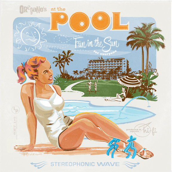
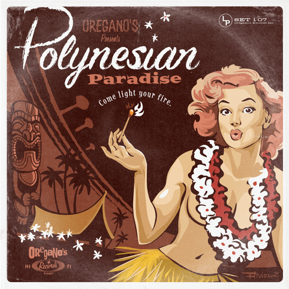
Album Covers: Part 2
January 3, 2012
Tiki Album Home for the Holidays
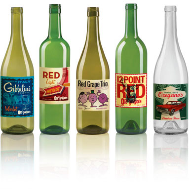
I was asked to create a series of wine labels with a retro vibe. I took that ball and ran… Read more»


Working with a talented agency in Seattle, i created some new 1 and 2 color interpretations of ‘the Quaker’ for Quaker Oats. Not sure this one will see the light of day, but a very interesting excercise in the subtleties of branding. Getting to work on an iconic piece of advertising history was a coup for me.
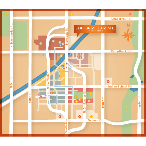
I recently completed map illustrations for various residential properties. Maps can be tricky, you must be very detail-oriented in approach… Read more»
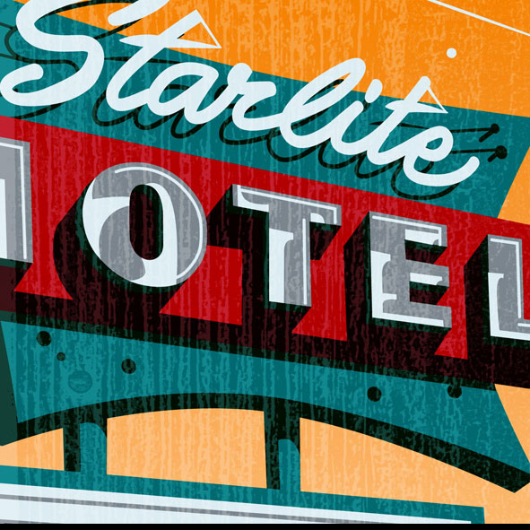
Illustration Vintage Motel Signs Driving down Main Street in Mesa Arizona is a timewarp, unique old motel signs jump out… Read more»

From an execution standpoint i am liking the warm tones achieved in his face and the gestural lines of the clothing. I always try to push my boundaries with projects like this, and it always yields something interesting.
WATCH OUT! don’t get burned…

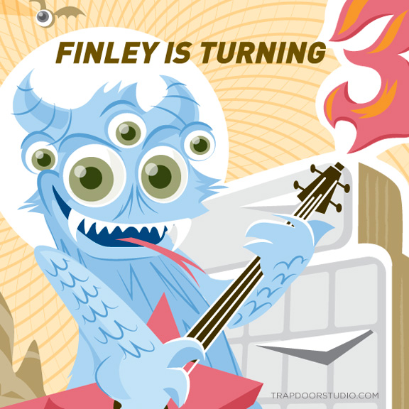
Finn pulled this exquisite birthday theme out of his back pocket a few weeks ago. I had never actually heard… Read more»
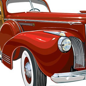
I made this piece damn near 10 years ago. Crazy to think it’s been that long. Saw this car in a parking lot on the west side of town while scouting for a photoshoot with Sullivan. He had his camera on him (of course) and snapped a few shots for me. The photoshoot never panned out, but i did get started on this piece soon after.

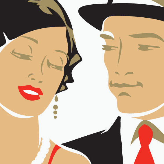
Have i really been doing the poster and invite for the past 8 years? yup, and i have enjoyed every year.
On this 20th anniversary my aim was to create a refined and rich look, employing custom typography and illustration using limited, but BOLD color. The background pattern and table setting were my favorite elements. O’Neil printing did a bang-up job with a rich double-hit black and spot varnishes.


Beardhead Packaging Illustrations The product cracks me up, and I was stoked when they asked me to illustrate some wacky… Read more»
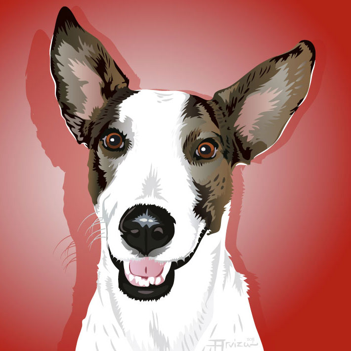
I spoke recently with my friend Hollye Schumacher about creating a piece of art inspired by her Photographic “Modern Dog”… Read more»
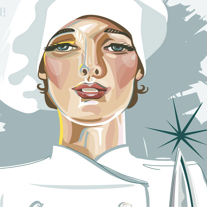
Just wrapped up the poster for the 2010 Flavors of Phoenix event. “Flavors” is a fundraiser for the Arizona Chapter… Read more»
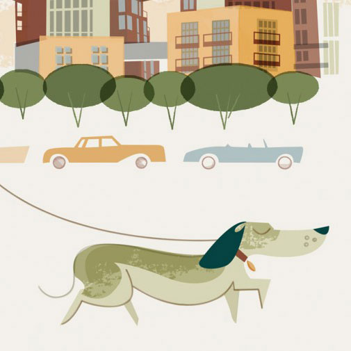
This fun poster was created for Safari Drive in Scottsdale. The property has a beautiful modern style and this poster… Read more»
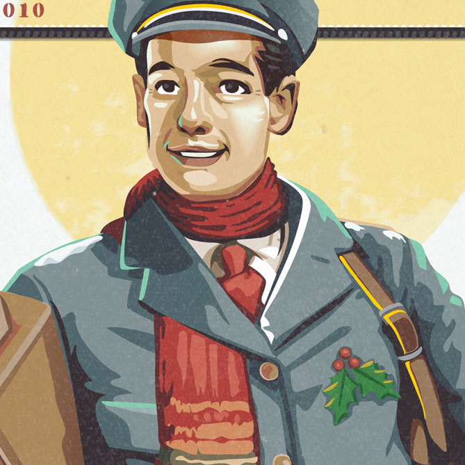
This Vintage inspired illustration was created in the spirit of the old Saturday Evening Post covers of the 1930’s-50’s. Harkening… Read more»
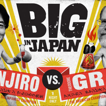
This Boxing Poster ran in Popular Science Magazine last year. A fun project to work on. Put up yer dukes!… Read more»

Created this typography last year for a story in Popular Science. Classic baseball script with an embroidered feel. my favorite… Read more»