
A Concrete Approach
June 2, 2014
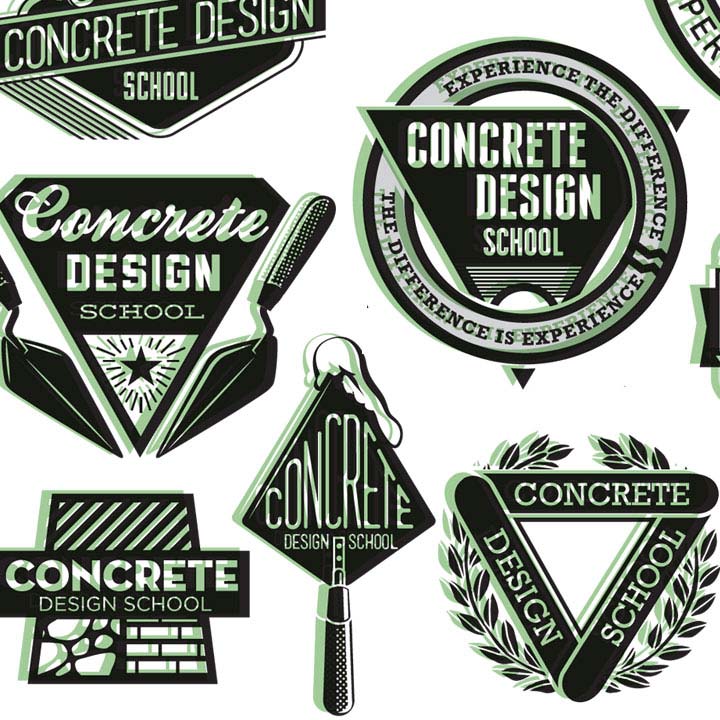
Logos are something I truly enjoy. The completeness of them, a neat little package. When I spoke with Brandon and… Read more»
Logos are something I truly enjoy. The completeness of them, a neat little package. When I spoke with Brandon and… Read more»
Having dust storms in the desert is nothing new. I’ve experienced them since moving here in 2001. But a few… Read more»

Last month I worked with a friend on a new branding project for a local solar company. American Solar was… Read more»

I am consistently challenged to create artwork for groups, industries and concepts that are new to me. That CAN be… Read more»

I don’t remember much from my high school German class except maybe a few standard phrases. Thankfully a grasp of… Read more»

Another year, another Flavors of Phoenix. The 2012 poster is here! 8 YEARS creating artwork and invitations for the American… Read more»


Working with a talented agency in Seattle, i created some new 1 and 2 color interpretations of ‘the Quaker’ for Quaker Oats. Not sure this one will see the light of day, but a very interesting excercise in the subtleties of branding. Getting to work on an iconic piece of advertising history was a coup for me.

Have i really been doing the poster and invite for the past 8 years? yup, and i have enjoyed every year.
On this 20th anniversary my aim was to create a refined and rich look, employing custom typography and illustration using limited, but BOLD color. The background pattern and table setting were my favorite elements. O’Neil printing did a bang-up job with a rich double-hit black and spot varnishes.
